Color accessibility: how to meet website accessibility standards for color
Color is a powerful tool for forging an immediate connection with visitors to a website. It can contribute to a strong first impression through a pleasing aesthetic. It can direct the visitor’s attention to the most important elements on the page. Most of all, it can set the tone, marking the difference between bright and friendly or moody and sleek. But what is an invaluable asset can easily become an obstacle when designers fail to account for the different ways in which users see color. This is why it is so important to design a website with color accessibility in mind.

Accessibility in website color essentially means making sure colors are performing to their true potential: enhancing the web browsing experience, not hindering it. There is a myth that designing for accessibility is all about reigning in creativity. In fact, accessible design often leads to a website that is more fluid and intuitive for all visitors. To this end, we’re going to delve into all the considerations for choosing website colors that meet accessibility standards.
A brief overview of website accessibility
—
Website accessibility is the process of designing a website (both the front-end visuals and back-end code) that works for users with diverse abilities. There are many categories of disabilities—such as vision, hearing, and motion impairments—and a designer will choose which situations to focus on and create solutions for.
Some common accessibility features on a website might include: facilitating easy keyboard navigation, providing alternative text that describes images, and ensuring that the site will not break due to upsized text. In this article, we’ll be focusing on color accessibility, but it is worthwhile to review how accessibility works as a whole.

Learn more about accessibility in web design >>
Website accessibility is also a legal matter in many countries, with accessibility non-compliance amounting to discrimination. In America, for example, this falls under the Americans with Disabilities Act, and a 2019 Supreme Court case reaffirmed that websites fall under the ADA, allowing users to sue businesses for failing to make their websites accessible in certain situations.
The Web Content Accessibility Guidelines (WCAG) for color
Internet standards are outlined by the World Wide Web Consortium (W3C), a global body made up of hundreds of organizations. For accessibility, the W3C has issued the Web Content Accessibility Guidelines (WCAG) to give developers and designers specific metrics to aim for. We’ll be referring to the WCAG throughout this article as it contains internationally recognized standards.
Note: At the time of this writing, the most recent edition is the WCAG 2.1, published in 2018, but the updated WCAG 2.2 is planned for publication in summer 2022.
The WCAG guides that relate to color largely fall under visual impairments. These are focused on contrast, ensuring that text is clearly distinguishable from the background. The guidelines also pay particular attention to how color is used as a visual cue, stipulating that there must be other elements to make these cues obvious. Color also must be specified in formatting code such as CSS (even if it is default white or black) in order for accessibility to be accurately measured.
Common impairments that are affected by color
—
As of 2021, the World Health Organization estimates that at least 1 billion people across the globe live with some form of disability, a number that is steadily rising. But these are recorded, measurable instances. Disabilities exist on a spectrum of severity, and some may go completely unnoticed by the person experiencing them for the most part. There is also a stigma that can prevent someone from seeking a diagnosis or even acknowledging that they are experiencing a disability.
Impairments can also be temporary and/or situational. For example, any person looking at a computer screen outdoors in harsh sunlight will be visually impaired by the sun’s glare. The ability to manually adjust the brightness and contrast of the screen in a situation like that is a form of assistive technology the manufacturer has provided. This is why accessibility in design is a much broader issue than many people realize. Creating accessible websites is not just ethical, it is good common sense.
With that in mind, let’s go over some common impairments that relate to color perception. Of course, disabilities can be complex and varied, but for the purposes of this article, we’ll be using general definitions just for the sake of context. The W3C provides excellent resources if you would like to learn about any of these impairments in detail.

- Color blindness: The name “color blindness” can be somewhat misleading—it does not necessarily mean that the person is blind to all colors. The degree can vary from person to person, as some are blind to only one or multiple colors.
- Low vision: This describes someone who has impaired vision short of total blindness. Their vision might be blurred, unfocused, or restricted (for example, tunnel vision means that a user would only be able to see the center of the screen whereas central field loss describes the opposite).
- Learning and/or perceptual disabilities: The main impairments we’ll discuss here are attention deficit hyperactivity disorder (ADHD; or difficulty to focus for sustained periods) and dyslexia (the mixing up of words while reading). A multitude of colors can provide a distraction in these cases. But, when implemented well, color can be an invaluable tool for focusing attention.
How color is used on a website
—
As an essential design element, color is a powerful tool for communicating visually. It is so useful that it is often implemented intuitively, without our consciously being aware of how it is working. In order to reassess colors used for accessibility, let’s zoom out and review the common purposes the color serves on a website.

In general, color exists to characterize, to direct attention and to provide feedback. More specifically, color is used for…
- Branding—A specific color scheme is an important factor in a business’s visual identity. Think of Netflix’s red or Twitter’s blue. In other words, color in this case acts as a visual shorthand for a brand name. While important, this often exists in the background, working on a subconscious level.
- Visual hierarchy—Color can be used to create emphasis and order on a page, providing visual landmarks for viewers to direct their eyes. For example, entire sections of the web page may be colored differently to signal differing content subject matter. On a smaller scale, a lightly colored box might surround less prioritized content, such as a tool tip.
- Visual feedback—Color can indicate whether a user has successfully completed an action. Red and green are the most common colors used for this purpose—a green checkmark when a user ticks a box or a red ‘X’ when a user clicks on something they do not have access to (red/green colorblindness also happens to be the most common form, by the way).
- Data visualizations—Color makes complex charts and graphs easier to read. This is especially true in the case of a pie chart, where colors are displayed side-by-side.
- Interactive text—Color can mark the difference between what is meant to be passively read and what is clickable. The most common example is the fact that hyperlink text is usually colored blue.
Tips for designing accessible website color schemes
—
Without further ado, let’s get into how you can apply accessibility principles to color schemes on a website design. Before we get started, make sure you brush up on the basics of color theory, particularly the color wheel.
Understand the basics of contrast
When you think about it, contrast is really what colors are all about. If everything was the same color, there’d be nothing to see. The most basic job of color in web design is to make something stand out on the screen: the question is to what degree and in relation to which other elements.
Contrast is how designers visually represent differences between design objects. It can be measured on a scale from high to low. An analogous color scheme would be an example of low contrast since the colors are mostly the same. A complementary color scheme, on the other hand, would be high contrast, as these are opposites on the color wheel.

One way to think about color contrast is in terms of value. Value (in art) refers to how light or dark a color is. When a colorblind or low vision person looks at the screen, value is what they will see instead of specific colors. Generating high contrast amounts to juxtaposing dark against light.
The WCAG provides recommended ratios for text-to-background contrast. These can vary based on the size of the text (larger text requires less contrast to be visible) and how high of a standard you want to adhere to. The WCAG ranks success on different levels, with AA representing minimum accessibility compliance and AAA representing the highest standard.
Level AA contrast standard
- 4.5:1 for text smaller 18pt
- 3:1 for text larger than 18pt
Level AAA contrast standard
- 7:1 for text smaller than 18pt
- 4.5:1 for text larger than 18pt
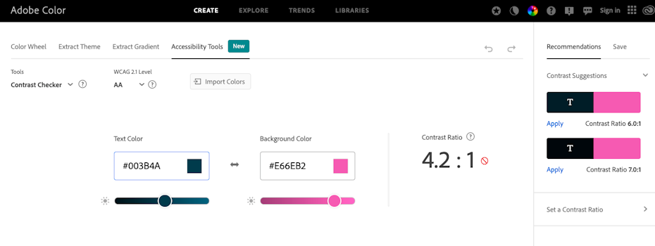
The easiest way to tell whether a color scheme fits in this ratio is to use an online contrast checker, of which there are several. Some popular ones are Stark (a plugin for Sketch), Adobe Color, and Contrast. Beyond these, a google search of “color contrast checker” should provide you with plenty of options to try out.
Typically, these will require you to find the hex code of your background/foreground colors (a six digit code preceded by a pound sign that represents specific colors) and enter that into the software. It is important to note that the ‘1’ in the aforementioned ratios represents your background color, and some contrast checkers will omit this number.
Create an accessible website color palette ahead of time
Website colors do not exist in a vacuum but must work in unison with one another. That is why it is important to plan out an accessible color scheme ahead of time so to make sure that the colors are in harmony while still fulfilling the WCAG standards for contrast.
In addition to the pre-established brand colors that are a part of a visual identity, web designers often need to account for a number of different color scenarios: including an accent color (often used for buttons), feedback colors (like a color signaling that a user is online), and the various stages of a hyperlink (mouse hover, pre-click and post-click). They will also need to decide on specific neutral tones (usually on the spectrum of white, gray and black) that will commonly be used for background, body copy and headers.

From here, it is simply a matter of testing these colors (using the contrast checkers mentioned in the previous section) to make sure they fall within acceptable contrast ratios. Fortunately, you do not have to test all of these for contrast against each other but only those that are in a background/foreground relationship.
In addition to the overall background of the website, keep in mind other colors that will serve as a background for text, such as a form field or information box. And of course, the accent color should have the highest contrast of all the colors as it is meant to stand out the most and be used sparingly.
Supplement color with additional design elements
A website can also fall below accessibility standards if color is the only indicator for important content. Web designers should supplement color indicators with other elements, such as icons, text, or animation.
For example, if a form field turns red when the wrong password is entered, this will be easy for someone with a visual impairment to miss. To mitigate this, UX designers commonly add at least one of the following: a tool tip that reads “Password incorrect,” an exclamation icon, and/or a shaking animation on the entire form field.
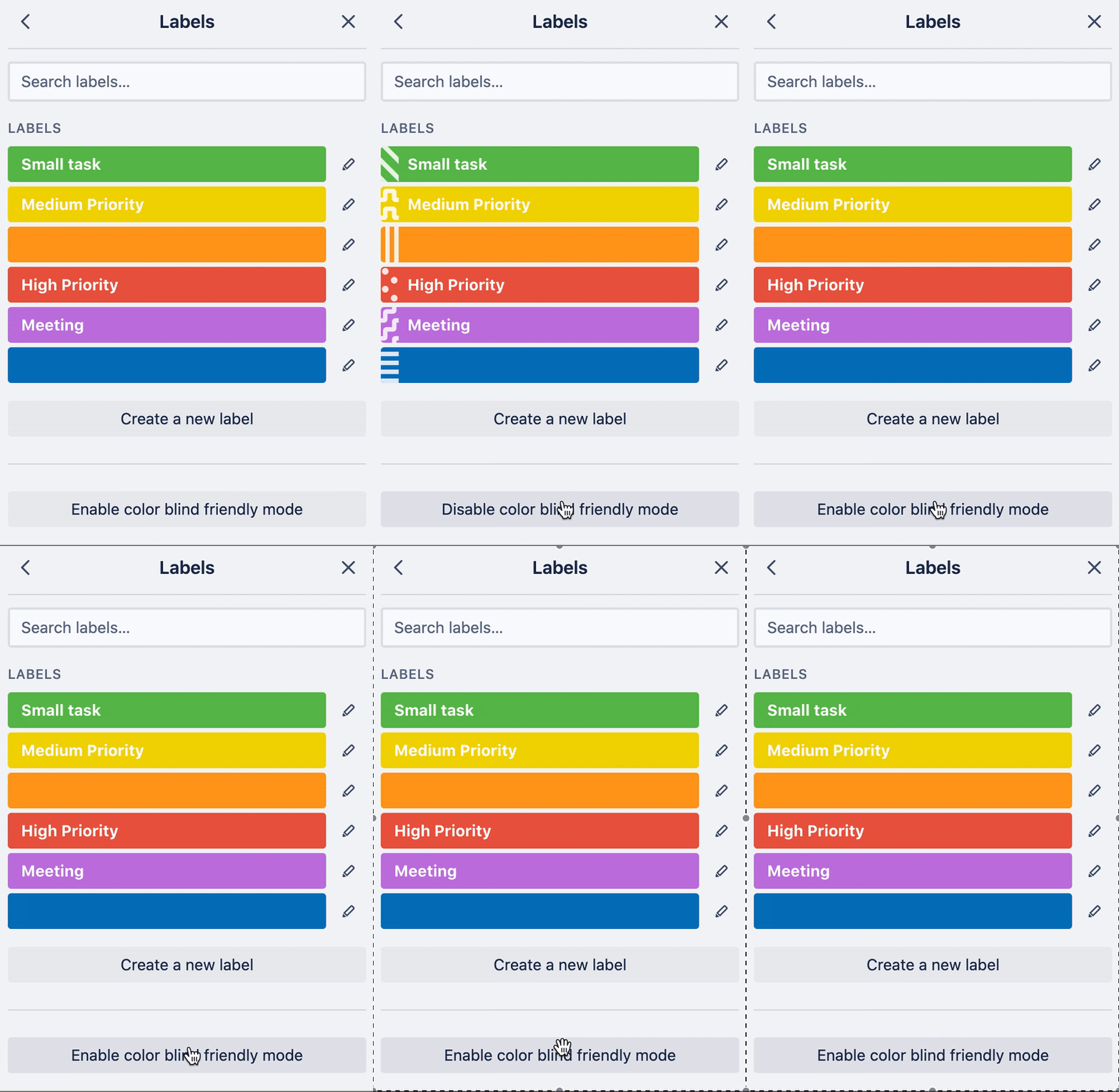
Similarly, the project management app Trello allows users to color code items with labels. But they also offer a colorblind-friendly mode which adds textures to the labels, making the difference between them more apparent.
Use color as an assistive tool
Designing colors for accessibility is not just about planning for a color-absent scenario. In some cases, color can be a handy tool for assisting viewers with reading the page.
In cases where a dyslexic person might have trouble getting through a paragraph of text, a special mode could use color to highlight one word or phrase at a time. This is a common strategy used by apps for learning foreign languages through reading, such as Beelinguapp. For bonus points, designers can include a border or a pointing finger icon to supplement the highlight color.

Accessible website colors benefit everyone
—
Accessibility is about more than addressing unique and rare edge cases. In fact, so many users are going to wind up with a form of visual impairment (whether temporary or permanent) at some point in their day-to-day lives that businesses cannot afford to ignore accessibility.
The good news is that there are clear guidelines and tools for assisting users with impairments. Of course, good color selection depends on more than ratios and math—it is an art form. That’s why when you need a website color scheme that is both accessible and visually stunning, it is important to make sure you’re working with a savvy designer.
Need help making your colors and website accessible?
Work with our talented designers to make it happen.
The post Color accessibility: how to meet website accessibility standards for color appeared first on 99designs.
