
Georgia Department of Health’s master class on misinforming with statistics
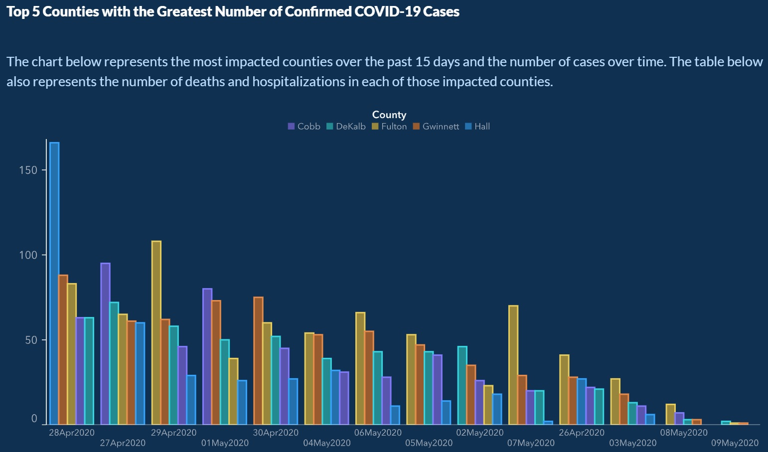
The graph released by the Georgia Department of Public Health.
Tap the graph to see it at full size.

Pictured above is a graph released a few days ago by the Georgia Department of Public Health, showing the top 5 counties in the state with the most confirmed cases of COVID-19.
You’d think that things were getting better, as it appears to show a downward trend — until you look more closely at the dates on the x-axis (the one on the bottom, going from left to right):
The same graph, but with the dates emphasized, revealing their incorrect order.
Tap the graph to see it at full size.
The dates are out of order. In fact, they’ve been specifically re-ordered to make it look as if the number of cases has been dropping steadily for the past few weeks.
Don’t see the trick? Look more closely (tap on the graph above to see it at full size), and you’ll see that the dates are listed in this order:
- April 28
- April 27
- April 29
- May 1
- April 30
- May 4
- May 6
- May 5
- May 2
- May 7
- April 26
- May 3
- May 8
- May 9
Whoever made the graph seems to have been counting on the math-phobia that many people have, people’s limited attention span, and possibly even general COVID-19 news fatigue. They took care to make sure that the first date on the x-axis was in April and the final date was in May, but assumed that most people wouldn’t look too closely at the dates in between. I’m almost in awe of the gall it takes to commit this act of deception so brazenly.
As a public service, I’ve re-ordered the graph so that the case counts are listed in proper chronological order:
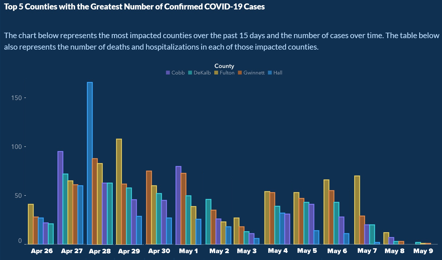
The graph, rearranged by me so that the x-axis is no longer deceptive.
Tap the graph to see it at full size.
There’s one more deceptive thing about the graph that you should notice, and which I don’t have time to correct: For every date, the county order is different (look at the colors of the bars). In fact, the order is always from highest to lowest number of cases, a design trick meant to fool the eye into seeing a consistent downward slope:

A number of eagle-eyed people on the internet caught this, and Georgia officials started back-pedaling quickly. Here’s a tweet from Candice Broce, Communications Director and Chief Deputy Executive Counsel for Georgia Governor Brian Kemp (who had to learn that you can be a carrier of a disease without showing any symptoms, and who’s been overearly eager to re-open the state):
The x axis was set up that way to show descending values to more easily demonstrate peak values and counties on those dates. Our mission failed. We apologize. It is fixed.
— Candice Broce (@candicebroce) May 11, 2020
Recommended reading
The Atlanta Journal-Constitution has a story on this: ‘It’s just cuckoo’: state’s latest data mishap causes critics to cry foul.
You should keep an eye out for deceptive graphs, as they’re getting used more often. Here’s one from last month:
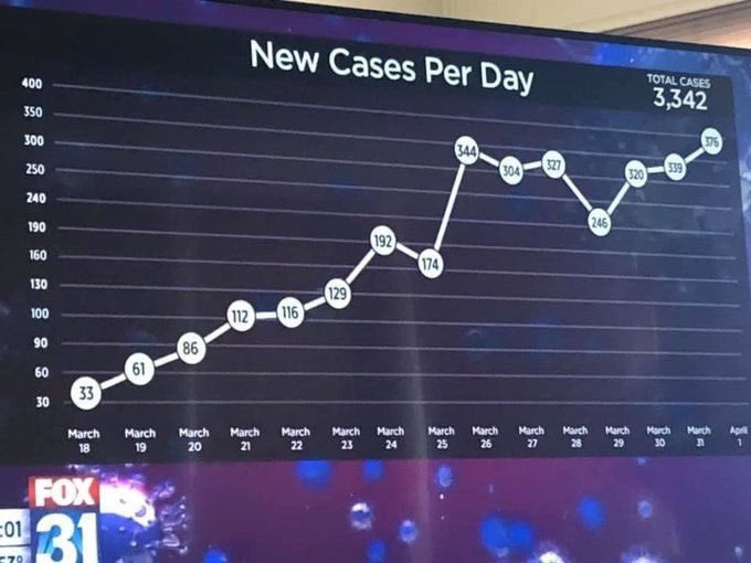
Tap the graph to see a slightly larger version.
Take a closer look at the graph’s y-axis:
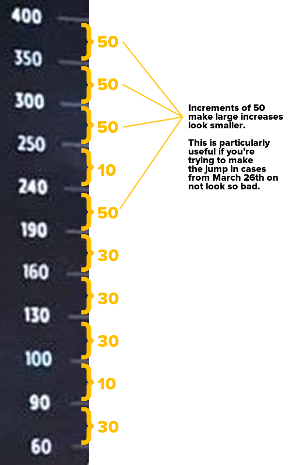
Remember this aphorism: “Numbers don’t lie, but liars use numbers.”
The post Georgia Department of Health’s master class on misinforming with statistics appeared first on The Adventures of Accordion Guy in the 21st Century.